Typography and font styles are the art of lettering based on the style and
size. How important, it conveys how it can change how a title sequence looks
like and the fonts fit the genre specifically of what has to be shown.
This is taken from a fashion magazine, which implies the bright colors used to suit the fashion concept.
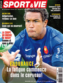
This is taken from a sport magazine which suggests the different typography used to attract the audience.
This is taken from a game magazine. The math’s
head is clear, white to draw the audience to see the math’s head
.
 This is an example of a Hip-Hop music
genre. This is an example of a Hip-Hop music
genre. The colour yellow contrast with the black colour. The bold font type has
centered the magazine front cover.
The colour yellow contrast with the black colour. The bold font type has
centered the magazine front cover.
This
is also an example of a music magazine, rap music genre. The math’s head used
two colour's which sets out an original look to the audience. With a rap
magazine I was expecting dark colour's, however the editor for this magazine
used two colours. Which suggests the two similar colour's the editor wanted to use.
1. Susan (dafont.com)
With this font type, I would like to
use this for the main headline. This is because it makes the writing look
original and stand out from the other text.
2. Sweet Sensations (dafont.com)
With this font type, I would use this for
my math’s head or maybe my contents page title. I may use this font type to get
the audience intrigued.
With this font
type, I may use it for my double page. This typography may be used to add a
unique effect to create a magazine that look different from other music
magazines.
For my magazine cover I used ‘Sweet
Sensations’ for my math’s head. I used the colour red to suit the Hip-Hop music
genre. The size of the math’s head is 100 pixels which I think it's a suitable size for the maths head.
For my main headline, magazine front cover
I used Susan typography. I used the colour red and white. The colour is the
continuous of House style, which suggests the continuous colour scheme and suggests to the reader of the same colours I'm using throughout my magazine pages.


No comments:
Post a Comment